


A telemedicine e-commerce Website that educates about customized ed treatment
Educate patients how Rugiet seamlessly connects patients with doctors for consultations, facilitates prescription approval, links to pharmacies for medication fulfillment, and delivers orders to their homes ensuring a convenient healthcare experience.
OVERVIEW
Rugiet Health is the pioneering company behind the creation of Rugiet Ready, an innovative sublingual and compounded treatment for erectile dysfunction. It uniquely targets both psychological and physiological aspects while providing rapid efficacy within 15 minutes. By combining the active ingredients in Viagra and Cialis with a powerful dopamine promoter called Apomorphine, Rugiet Ready has swiftly risen as a leading contender within the realm of ED treatments. While each active ingredient is individually FDA-approved, the custom compounding formulation of Rugiet Ready falls outside FDA regulation due to its customizable strengths.
Challenge
The challenge lies in users' growing skepticism towards the credibility of the customizable ED treatment, which stems from insufficient information on a poorly designed e-commerce website. Numerous users encounter unfamiliar UI designs and inconsistent patterns, leading them to question the legitimacy of the website. Additionally, the absence of clear information about the process of connecting patients with doctors and pharmacies within a single platform only increases these concerns and bounce rate.
the Project mission
Aim to alleviate user skepticism and foster confidence in the telemedicine process while promoting accessibility and transparency regarding clinically accurate information.
Project Scope
Build a prototype for an online e-commerce platform that establishes instant credibility on a clinical level
Tools
Zoom, Teams, Hotjar, Figma
Role
Lead UX/UI Researcher & Designer
Groups
1 UX Designer
2 Data Analysts
1 Web Developer
1 Clinical Researcher
Duration
6 Weeks
+ 3 Weeks Develop & QA testing
Deliverable
Hi Fidelity Figma
Live Web Prototype
Our Design process

Understanding the problem
Although the e-commerce website appeared unappealing overall, it's crucial to dissect the specific elements contributing to this sense of distrust, particularly when we are asking patients to invest significant sums of money for a subscription based ED treatment via the telemedicine platform.
My research encompassed:
-
Understanding who the user is and his needs/goals.
-
Uncovering pain points with the existing user journey of dealing with ED.
-
Validating the correlation between brand credibility and bounce rate.
-
Confirming that users' lack accessible and sufficient information on the what Rugiet Ready is and works.
Research Methods
Heuristic Evaluation
Contextual Observations
User Interviews
Heat Maps
User Screen Recordings
C&C Analysis
Secondary Research
Discover
Gathering Insights
In order to begin my research, I needed to establish my own personal understanding of our offerings and what we do as a company. With fresh eyes and minimal knowledge of telemedicine, I conducted a heuristic evaluation on the entirety of the customer's journey.
I found myself asking more questions and needing additional explanations for each segment of copy. The website layout felt unfamiliar. Animations were more of a distraction than providing any guidance or clarity. Unusual icons were being used. All the CTA buttons looked different and bolded words revealed hidden information if hovered over with the mouse.


Distracting animations and easily overlooked copy.

Inconsistent button design and copy that need improvement.
What is Rugiet Ready really?
From a user's perspective who has never heard of Rugiet Ready, he would most likely want to know what the little blue cube is called. One of the biggest discoveries I made is that we suffer from a product identity crisis.
Our website refers to Rugiet Ready several ways:
-
compounded erectile dysfunction treatment
-
sublingual melts
-
custom dose
-
3-in-1 troche
-
melt
-
experiences


Different sections throughout the homepage have called Rugiet Ready different names.

Unusual animations and interactions that only create more confusion. Additionally, requiring more work for the user to reveal hidden information inside tooltips.
Validating my initial findings
The Plan
Conduct contextual user interviews of participants interacting with the e-commerce website.
Number of Users
6 men
5 desktop users
1 mobile user
Occupations
Mechnical Engineer, Social Worker, IT, Contract Manager, Sales Rep Manager, Cyber Security
Tasks
1. Express 1st impressions
of the website.
2. Sign up
Age Range
34 - 41
Key Quotes From User interviews
If I felt this way, what are users saying?
"What is this?"
"Does sublingual mean compounded?"
"There is way too much math involved."
"You chew it, right?"
"I wouldn't buy from this site. It doesn't feel legit."
The results
-
6/6 users asked "What does compounded mean?"
-
6/6 users took an extensive amount of time to realize it was a medication to treat ED.
-
6/6 users found the graphics to be confusing.
-
6/6 users accidentally hovered over bolded words and symbols.
-
6/6 users believed the product is chewed in order to consume.
Competitive & Comparative Analysis
-
I reviewed our top competitors to understand where our weaknesses lie.
-
Our competitors have a clear identity and consistent brand that exudes professionalism and credibility.
HotJar Data
-
Q1 & Q2 of 2023 combined revealed our total # of sessions: 18.3k desktop sessions, 12k tablet sessions, and 170.3k mobile sessions.
-
Our e-commerce website is not optimized for mobile which resulted in a 70% bounce rate on mobile.
-
Of the users that stay, screen recordings revealed user behavior seeking more information but ultimately rage clicking on poor UI elements.
Technical Constraints
-
Our e-commerce website was built in WebFlow and our newly hired web developer has not worked in WebFlow before.
-
Creative decision power overshadowed by the marketing department and some stakeholders.

Product hero image looks artificial and overly photoshopped.
Define
Focusing on Education and user comprehension

Completed customer journey map from entry to purchase.


The top 3 taps on mobile involve seeking additional information.


Desktop first design results in poor conversions on mobile due to bad experiences and poor UI.

Product page continues to use unfamiliar UI patterns and format.

Use of familiar actions that are not functional and unfavorable emojis like the laughing face.

The FAQ page uses a very outdated brand style guide.
The problem
Users need a quick and simple way to learn about Rugiet Ready while building brand trust so that they can buy customized ED treatment with confidence.
The Solution:
website V1.5
Create an e-commerce experience that requires minimal effort to find medically sound information about Rugiet Ready. The website is designed with a strong focus on education and comprehension so that the users build immediate rapport with the consistent branding and copy.
Along with excellent UX copy, I implemented consistent design patterns and elements so that it establishes a level of professionalism and credibility throughout the customer journey. By creatively recycling existing assets, I managed to make the website feel more modern.
Key features

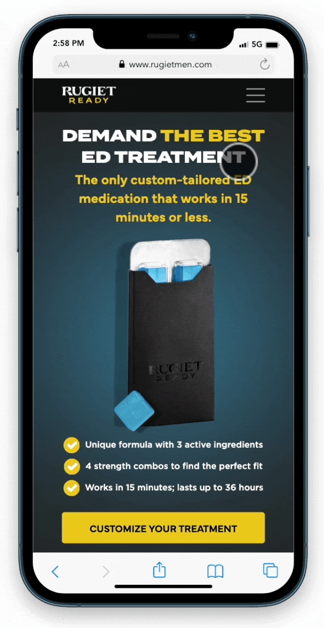
Giving the user powerful hero text and imagery designed for mobile first for immediate buy-in.
Upon entry to the e-commerce website, the user does not have to scroll below the fold in order have enough information to make an informed buying decision.
Hero text, hero image, and three unique selling points with an enticing CTA is enough to retain the user's attention to learn more. Directly below the fold are user pain points and our strongest social proof referencing a quote from Men's Health for instant credibility.
Designing for responsive UI so that the website is optimized for all screens.
Regardless of what device screen size is used, the user will pleasantly navigate a seamless UI experience. This redesign follows familiar UI patterns so the user can quickly digest and find information to make a sound buying decision.
CTA buttons are all consistent in style and designed to grab the user's attention. UX copy is clear and concise with just enough words for comprehension.

Consistent styling and adhering to the company's latest brand guidelines on all webpages: Product, FAQ, and Blog.
Across all webpages, there is finally uniformity and a consistent style. All copy serves a purpose and color choices engage user's psychologically to take action.
Any evidence of the previous brand styles and colors have been removed. By doing so, this elevates brand credibility and authenticity.
Simplifying medical jargon so that the common man can easily understand.
Our users already want to avoid in-person doctor consultations. Our goal is to eliminate the need for additional information due to overcomplexity of medical jargon and oversimplified slang that needs further explanation.
With our in-house clinical researcher, he and I were able to find a happy medium that combines good sales copy while maintaining clinical accuracy. We successfully removed all tooltips that were used to hide definitions and important information.


As the sole UX/UI Researcher & Designer, I took initiative to redesign our e-commerce website on top of the several projects I was working on.
Design
Let's begin with how I came up with my solution.
This website redesign was a mad dash to complete quickly so that we can finish with a strong 2023 Q4 performance of decreased bounce rate and increased revenue.
With some guidance on e-commerce sales funnels from our CTO, I researched the art of long sales letters (LSL), video sales letters (VSL), and webinar sales letters (WSL).

I identified 5 questions to ask to write better UX copy for a high-converting sales page.

I took the answers from the previous five questions and wrote out the 10 sections that tell our story that makes sense for the user to stay engaged.

I continued to brainstorm and answer the same questions with a better understanding of our offerings. I also had teammates and engineers chime in this discussion.


Left: Additional brainstorming with a focus on LSL formatting.
Right: The first lo-fi wireframing done designing for mobile first.

With the layout of sections drafted, our clinical researcher and I collaborated to fine-tune the copy to tell our story with clinical accuracy.
We took the lo-fi sketches and began to create our hi-fi wireframes with the guidance of the current brand style guidelines of fonts and color palettes.
I created the mobile design first and then tablet and desktop designs after.

Breakpoints to ensure proper responsive design across all devices.

Setup my color palettes in Figma to abide by the brand guidelines.
Deliver
Once the hi-fi designs and prototype were completed and QA tested by our in-house graphic designer, I handed off the Figma file to our web developer.
Due to the level of urgency to launch this e-commerce website by the start of Q4, we worked simultaneously conducting QA as it was being developed in segments.
The redesign with Rugiet Ready v1.5 was launched November 2023. Minor delays during the QA process but we launched it to drastically improve our reputation and credibility for Q4.
THE OUTCOMEs
-
Bounce rate decreased from 70% to as low 27% in Dec 2023
-
An uptick in conversions mid Nov after we launched
-
Nov 2023 - we acquired $1.7 million in total revenue
-
Dec 2023 - we acquired $2 million in total revenue
-
Jan 2024 - we repeated $2 million in total revenue
Next Steps
Considering that this was my first attempt at redesigning our e-commerce website, I know we lack lifestyle imagery. The assets we had were limited and some files were inaccessible. However, the copy and content is there.
I would love to reiterate on adding minor tweaks like pricing and ideate on how to better trigger the emotional buy.
Another major issue I would address is how we present the product as this bright glowing blue cube. The product is actually a dark green. Despite our reasoning in the FAQs (stating it is due to the active ingredients mixed with the blue coloring which turns it dark green), my research has shown that many customers question if the medication is expired upon delivery. My goal in the future is to add that additional sense of credibility where the product image matches visually the product the customers receive.
This is part of the creative constraint regarding creative decision power with marketing and some stakeholders.

Left: Product without any active ingredients.
Right: Actual product with active ingredients.


Concept photography by me. Reimagining our old packaging with the gold foil and leaning into the green color medication.

